A website that makes people stop.
A small, premium site on klutchadvisory.com.au, built to do what the brand already does in a room: turn heads and hold attention. Cinematic, motion-led, built straight from the brand toolkit. The jaw-drop is the brief.
A category brand deserves a category website.
Fearless action, calculated logic — on screen.
Klutch doesn't look like an accounting firm, and that's the entire point. The brand is black, red, and decisive: a wordmark with tension built into it, a halftone terrain that resolves into data, a grid cross that marks precision. Most advisory websites look like a tax return. This one shouldn't. The opportunity is a small, beautifully made site that carries the full force of the brand — the kind of presence that lands the moment someone Googles Klutch or a client opens the link.
Why a small multi-page site
Three short, considered pages — Home, About and Contact — rather than one long scroll. It's the model behind the sites Klutch likes (Quinn, cassette): each page does one job exceptionally, nothing is mega-scrollable, every section is art-directed. It feels premium precisely because it's restrained. This isn't a conversion machine bristling with CTAs; it's a brand statement that happens to make getting in touch effortless.
Why it works
The references Klutch admires — Quinn Global Tax Law, the Watch-Minder concept, our own Thrisk build — all win the same way: cinematic first impression, considered motion, and restraint. That's exactly the calibre this scope delivers, in the Klutch palette, in two weeks.
Three pages. One price. Everything in.
No tiers, no add-ons, no surprises. We design, write the flow, build, animate and launch.
What's included
- Direction + tone session (90 minutes)
- Built to your branding team's designs (design supplied separately)
- Three pages: Home, About (with team + careers), Contact
- Page flow + copy written by us; your content slotted & polished
- Motion throughout: scroll animation, reveals, transitions
- Animated hero: terrain + crosshairs morphing to KLUTCH
- Video + animation produced with your design team
- FK Grotesk + Azeret Mono set exactly to brand
- Grid-cross system + halftone terrain in motion
- Pixel-perfect responsive: desktop, tablet, mobile
- Contact form to your inbox
- Fast hosting set up, domain connected, launched
- 14-day post-launch support
Visual/brand design is delivered separately by Klutch's branding team — this $10k covers the build. Also not in this price: ongoing analytics/SEO retainer, ongoing content, and any additional pages or interactive tools — each scoped as its own phase if wanted.
Built to make jaws drop.
Three brand pillars, translated straight into how the site behaves. (We bring your branding team's designs to life.)
Cinematic first impression
A full-bleed video hero carrying the brand film, the giant KLUTCH wordmark and red grid crosses. The page announces itself before a word is read — offense as the best defense.
Evidence on display
Count-up stat blocks, named outcomes and clear proof, structured the way Quinn puts numbers front and centre. Every bold claim anchored to something measured.
Considered motion
Curtain reveals, headline line-by-line entrances, statement marquees and a drag-to-explore card system — motion with restraint, applied to support content, never distract from it.
A working sketch of the Klutch homepage.
Not the final design — a live demonstration of the craft level this build carries, running right here in the page.
Watch the intro · hover the button · scroll for the reveal
A sketch, not the design — this is the Home hero. The real pages come out of the week-one direction session. On the live build the hero loads the way Thrisk does: the terrain settles and unblurs, the tagline arrives, then the crosshairs morph into KLUTCH (a scramble-text resolve is the alternative). The brand films sit alongside this file — keep them together. Additional video assets and animation sequences will be created with your graphic design team during the build.
The team section (About page) — scroll showcase
scroll to play

Our team — scroll showcase: "OUR TEAM" sits centred in red while the portraits drift through at different speeds as you scroll. The portraits here are AI-generated placeholders; your real team photos and names drop straight in.
The calibre this scope delivers.
The references Klutch admires, and the work we ship on the same stack. Click through — the motion is the point.

Quinn Global Tax Law quinngtl.com ↗
The closest analog: a global tax & legal advisory firm. Editorial type, numbered services, big proof numbers, calm authority. Exactly the trust-in-seconds approach for Klutch.
Watch-Minder concept ↗
A jaw-drop single-page concept: video hero, animated letter reveals spelling MOTION, drag-to-explore collection, statement marquees. The motion benchmark for this build.

Thrisk thriskinsure.com ↗
Specialist insurance for complex industries. Video-led hero, editorial type, a B2B site built to earn trust in complex sectors fast. Our build, our stack.
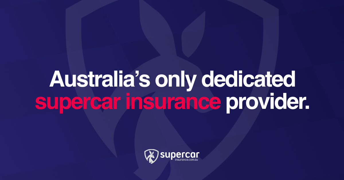
Supercar Insurance supercarinsurance.com.au ↗
Australia's only dedicated supercar insurer. Premium positioning, concierge feel, motion-led storytelling — proof we build dark, confident, high-end pages.
Three short pages. Every section earns its place.
Home, About and Contact — the Quinn model. Nothing mega-scrollable; each page does one job, beautifully.
Home
/- Cinematic hero — animated terrain, crosshairs morphing to KLUTCH, tagline, nav. Brand film
- Positioning — "Fearless action, calculated logic," set big.
- Services — the core service lines, clean and confident.
- Proof — a case study or a key number; the evidence behind the boldness.
- Close + footer — a quiet prompt through to Contact.
About
/about- Hero — a modified hero; the Klutch story in a line.
- Approach — a card section: the three pillars, how Klutch thinks.
- Meet the team — scroll showcase grid. Scroll showcase
- Proof / quote — a client quote or short case studies.
- Join us — careers block, "interested in joining us." Careers
Contact
/contact- Hero — a modified hero, kept simple.
- Contact form — to your inbox. Form
- Details — phone, North Melbourne address, map.
Why an AI-accelerated custom build.
The brand is the product here. The platform has to keep up with it.
Template builders cap the motion and bend the brand to fit their boxes. We build it custom — coded, not dragged-and-dropped — so your branding team's designs land exactly to spec: the KLUTCH wordmark, the FK Grotesk, the halftone terrain and the grid crosses, pixel-faithful. AI runs through production (scaffolding, copy drafts, QA sweeps) while people stay on judgement: motion, interaction and the final word on every pixel. The result is a build that does the design justice, in two weeks, at a fixed $10,000.
| Approach | Motion & animation | Brand fidelity | Time | Cost |
|---|---|---|---|---|
| Template builder | Capped, fights you | Compromised to the template | 1–2 weeks | Cheap, but looks it |
| AI-accelerated custom (this scope) | Anything the design calls for | Exact to the guidelines | 2 weeks | $10,000 |
Designed, built and live in two weeks.
Paced for a motion-heavy, art-directed build and a team that cares about the detail.
Direction + build kickoff
- 90-minute direction and tone session with Klutch + your branding team
- Motion language set from the brand toolkit (type, palette, grid cross, terrain)
- Designs received from your branding team; build begins on Home
- Page flow + copy written by us; your content slotted, issued for edits
- Video assets and motion sequences scoped with your design team
Build · motion · launch
- All three pages built to pixel spec, brand film integrated into the hero
- Motion pass across every section — produced with your design team, performance-budgeted
- Copy edits loaded, contact form wired to your inbox
- Responsive QA across desktop, tablet and mobile
- Hosting set up, domain connected, launch
Support
- 14-day support window for tweaks and fixes
- Quick handover: how to edit copy and swap the hero film
One price, staged against delivery.
$10,000 + GST, end to end. Billed across two milestones.
| What the fee covers | Itemised |
|---|---|
| Custom build — three pages, motion, copy flow & launch (to supplied designs) | $10,000 + GST |
| Brand-film integration + additional video/motion (with your branding team) | TBC |
| Milestone | Amount |
|---|---|
| 50% on signing (kicks off week one + the session) | $5,000 + GST |
| 50% at launch (end of week two) | $5,000 + GST |
Visual/brand design is provided by Klutch's branding team and billed separately. Operating costs (hosting, domain renewal) are billed direct to Klutch; we set the accounts up in Klutch's name so billing flows direct. An analytics + SEO retainer and any extra pages are available as a separate phase.
What needs to happen for week one to start Monday.
Approve the scope
- Sign off this scope and the milestone schedule
- $10,000 + GST, end to end, live in two weeks
Provide inputs
- Designs from your branding team (or a direct line to them)
- Brand assets + FK Grotesk web-font licence files
- Your pre-written content (we shape it to the page flow)
- Team photos + any photography or video footage
- Where the contact form should land (email)
- Registrar or DNS access for klutchadvisory.com.au
- A design-team contact for the motion/video collaboration
Kick off week one
- Deposit invoice issued
- Direction session scheduled
- Reviews booked; live at the end of week two
The brand already turns heads.
Now build the site that lives up to it.
Approve the scope and the new klutchadvisory.com.au is live two weeks later — crafted to the standard the brand sets.